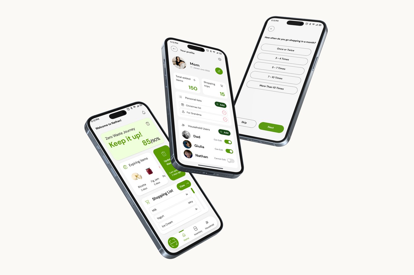
Nathan app screens: home with zero waste score and expiring items, household profile, and onboarding

At a glance

Problem. Households waste food because of unorganised lists, overbuying and poor inventory knowledge, and the decision happens before anyone reaches the bin.

Approach. Focus on the moment someone decides what to buy. One home screen shows the zero waste score, expiring items and the active list together.

My part. Persona and desk research, naming and identity, and wireframes from hand sketches to mid-fidelity.
Overview

Nathan tackles zero waste behavior by focusing on the first step of the journey, the moment someone decides what to buy, rather than imposing restriction after the fact.

Research

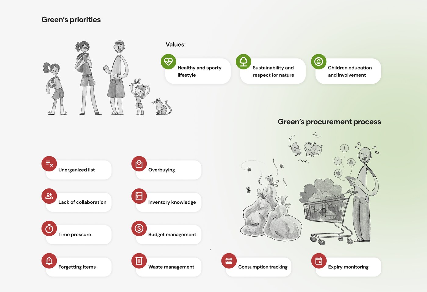
Research centered on "Green," a persona built around a household's values (a healthy, sporty lifestyle, sustainability, children's involvement) and its everyday procurement pain points: unorganized lists, lack of collaboration between household members, time pressure, forgetting items, overbuying, poor inventory knowledge, budget management, and food waste.

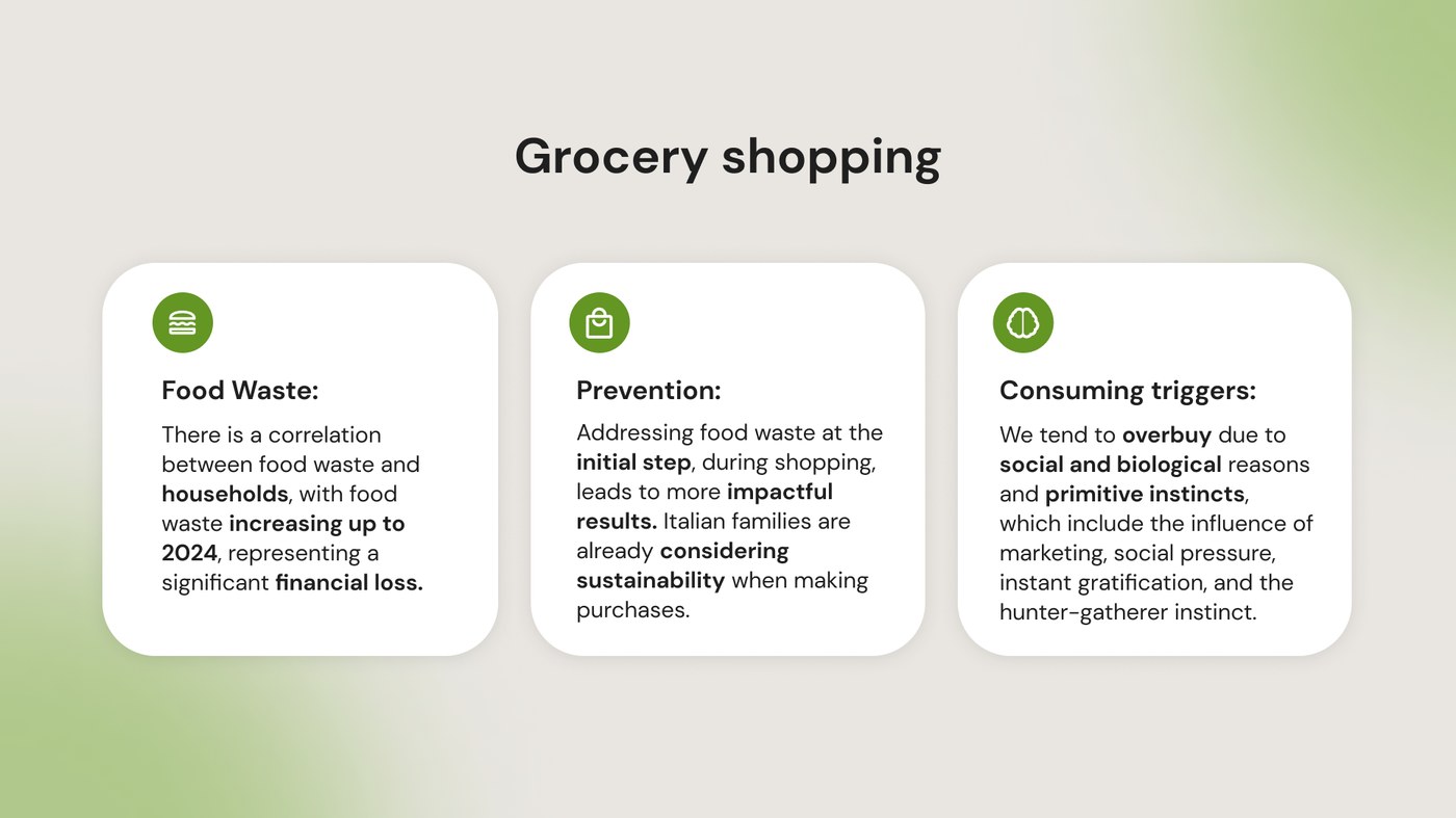
Desk research set the scope. Food waste rises with household size and carries a real financial cost; tackling it at the shopping step, before anything is bought, has the most impact; and overbuying is driven by marketing, social pressure and instant gratification rather than by need.

Persona research: household priorities and grocery procurement pain points
Household priorities mapped against the friction points in a typical grocery procurement process.
Desk research: food waste, prevention and consuming triggers
Desk research: food waste correlates strongly with household size, and addressing it at the shopping step shows the most impact.

Design decisions

Each decision answers a specific finding from the research above.

  1. Start at the shopping list, not at the bin

    The product is built around planning and buying, with tracking as a consequence.

    EvidenceDesk research: addressing food waste at the initial step, during shopping, leads to more impactful results.

  2. Three things on the home screen (Hick's Law)

    Only the zero waste score, expiring items and the active shopping list. Options are kept to a minimum at each step.

    EvidencePersona pain points: time pressure and forgetting items. Fewer choices on screen means a faster decision in the middle of a busy day.

  3. A list grouped by category (Miller's Law)

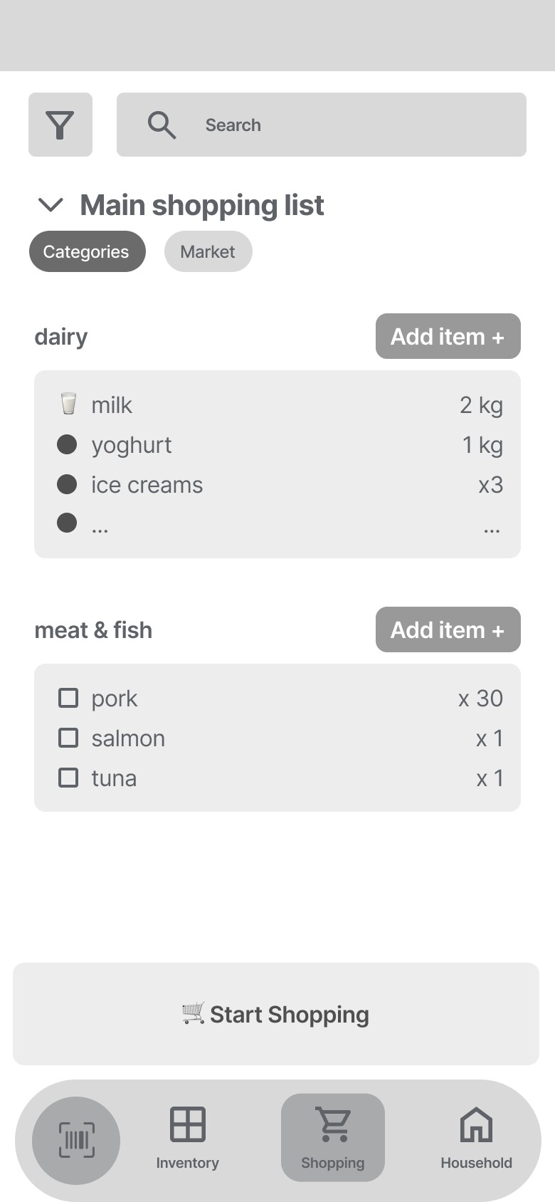
    Items are grouped as dairy, meat & fish and so on, so a long list reads as a few short ones, with a market view one tap away.

    EvidencePersona pain point: unorganised lists. Chunking keeps each group within what people can hold in mind at once.

  4. Expiring items before anything else

    What is about to go off is the first content on the home screen.

    EvidencePersona pain points: overbuying and poor inventory knowledge. Desk research: overbuying is driven by impulse, so the counterweight has to be visible before the next purchase.

  5. One household, shared lists, set permissions

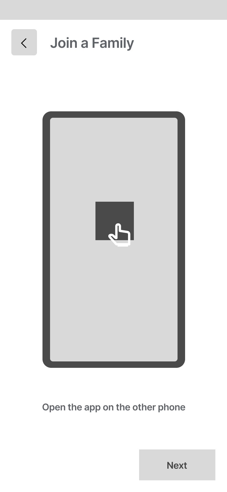
    Joining a household takes one step, and each member gets edit rights or view-only access.

    EvidencePersona pain point: lack of collaboration between household members. Persona value: children's education and involvement.

  6. Progress, not restriction

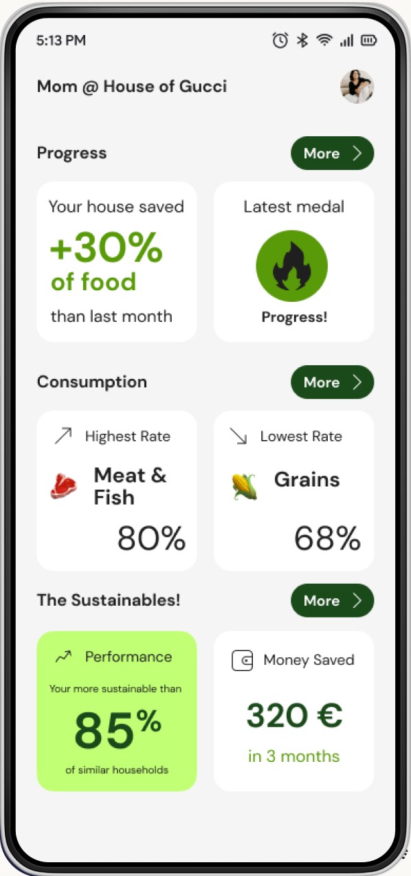
    A sustainability dashboard shows food and money saved instead of warnings about what was wasted.

    EvidenceChallenge statement: promote zero waste behavior without imposing a sense of restriction. Persona pain point: budget management.

From sketch to structure

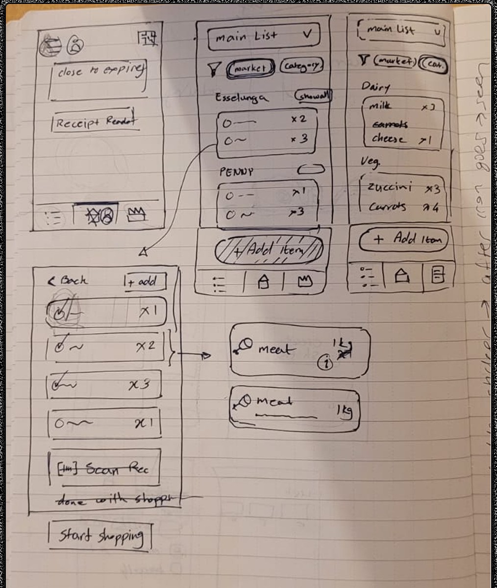
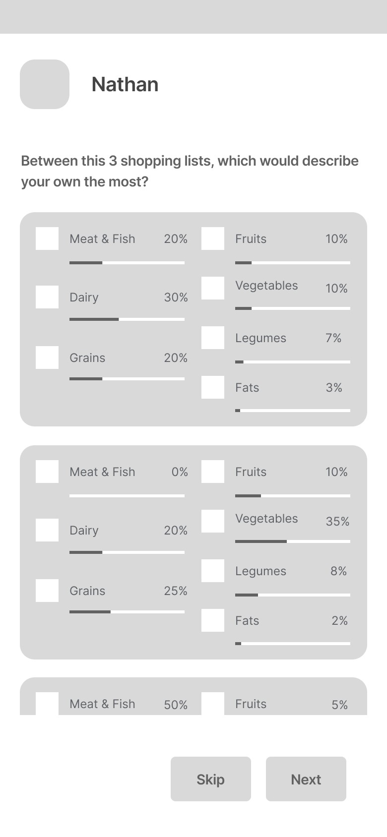
I started on paper. The first sketches explored a home for items close to expiry, a main list that switches between market and category views, and a receipt scan to close each shopping trip. Those ideas became mid-fidelity wireframes for onboarding, joining a household, the shopping list and consumption tracking.

Hand sketch of the Nathan flows: expiring items, main list with market and category views, receipt scan
First pass on paper: expiring items, a list with market and category views, and a receipt scan.
Onboarding wireframe: choose the shopping list that describes yours the most

Onboarding asks which of three shopping lists sounds most like yours.

Join a family wireframe: open the app on the other phone

Joining a household: open the app on the other phone.

Shopping list wireframe grouped by category with a Start Shopping button

The main list grouped by category, a market view one tap away, and a single Start Shopping action.

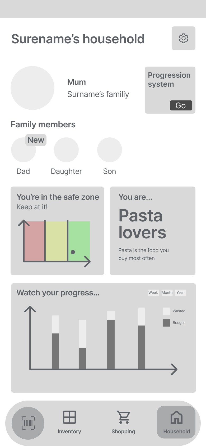
Household wireframe with bought versus wasted chart and a safe zone indicator

Household view: bought versus wasted over a week, month or year, plus a safe zone indicator.

Early wireframes with placeholder copy, before visual design.

Product & naming

The home screen surfaces a zero waste score, expiring items and the active shopping list together, so the habit-forming moment is the first thing someone sees. A separate household screen lets everyone in the house share lists and permissions.

The name follows the same idea. Nathan gives a shopping tool the personality of a helpful presence at the moment of decision, rather than a purely functional label. It was chosen under a tight timeline, and it is also, fittingly, the middle name of Sylvan Nathan Goldman, the inventor of the modern shopping cart.

Nathan logotype with its three core features: shopping list, store management, consumption tracking
The identity and the three features it carries: shopping list, store management and consumption tracking.
Sustainability dashboard screen showing food saved, consumption rates and money saved
The sustainability dashboard, turning the household's own data into visible progress.