Problem. A major film archive with broken navigation and no shared logic for where anything lived.
Approach. Heuristic evaluation, personas, benchmarking and card sorting, then a rebuilt information architecture and a responsive redesign.
My part. Logo design, visual system and experience design. I led the overall project direction.
Deliverables. Web and mobile prototypes and a new identity.
The problem
One of Italy's most significant film archives had a website that actively prevented people from finding its content. The problem wasn't aesthetic, it was structural: broken navigation, no consistent information architecture, an identity that read as loud and fragmented rather than archival and cinematic.
Process
Heuristic evaluation and cognitive walkthroughs against the existing site, five user personas, and a competitive benchmark against Tate, the Getty, and Cineteca di Bologna. Card sorting with 8 participants confirmed what the walkthroughs suggested: no home page to orient from, no way to search, and no shared logic for where anything lived. That reconstructed IA fed directly into wireframes and a high-fidelity responsive design.
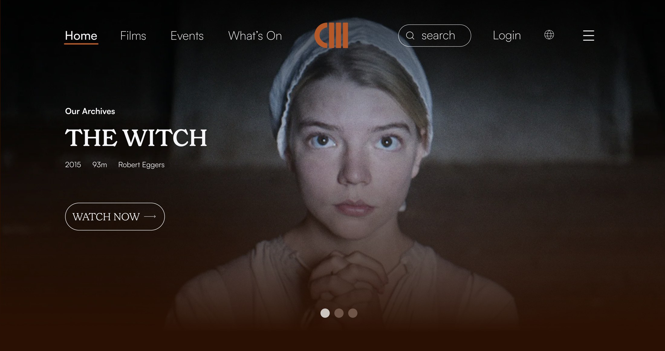
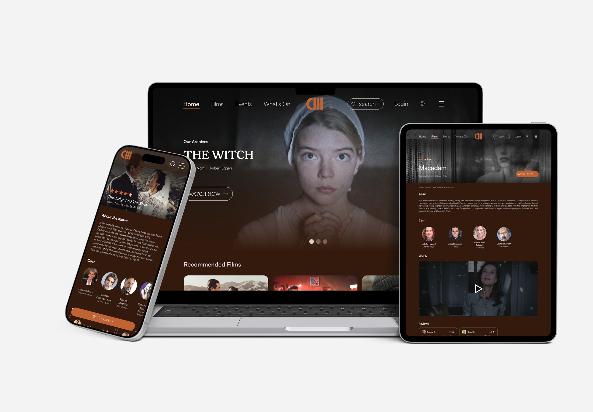
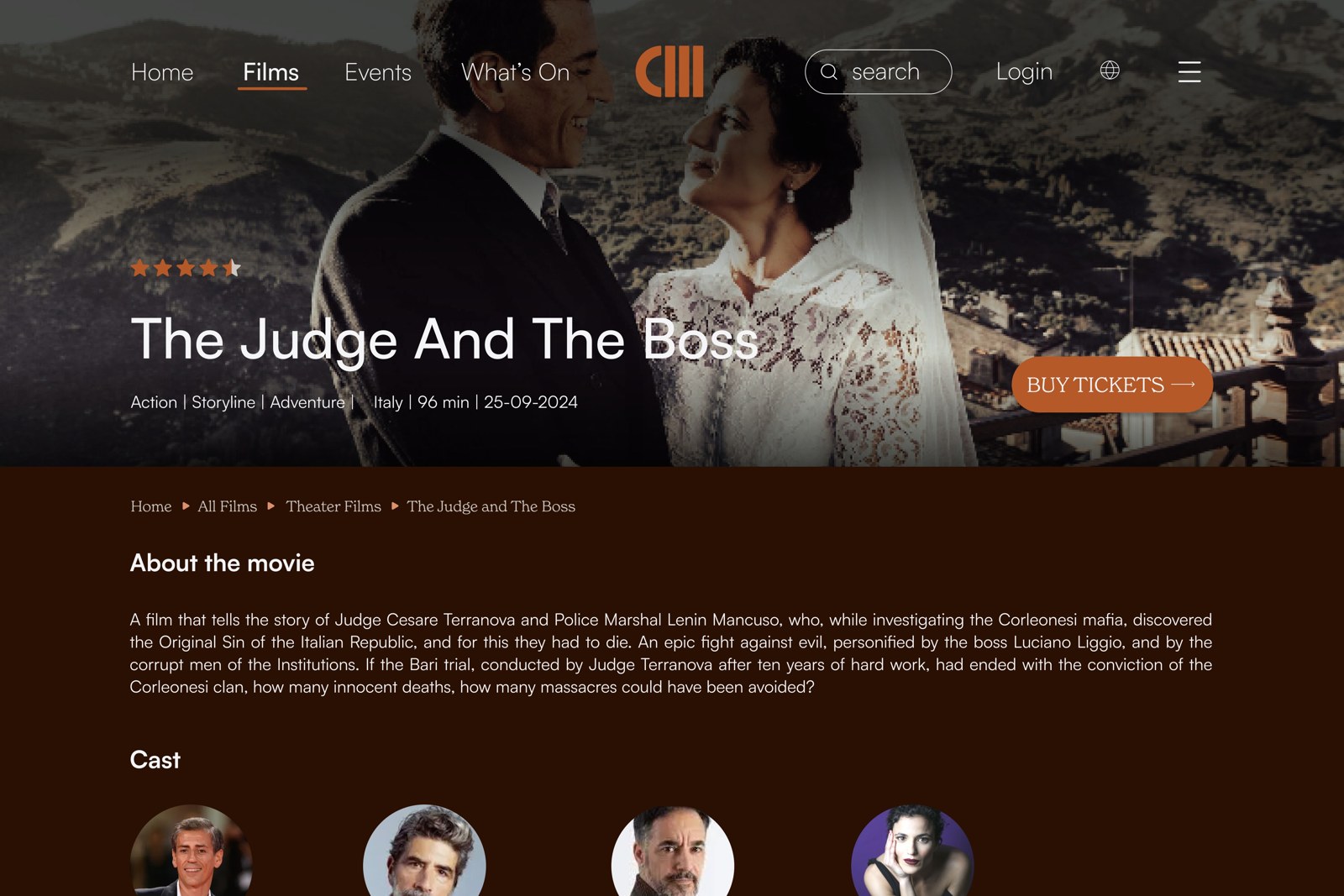
A home page that orients
A single entry point that shows what is on now and where the archive lives.
EvidenceCognitive walkthroughs and card sorting (8 participants): there was no home page to orient from.
Search in the main navigation
Search sits next to Films, Events and What's On on every page.
EvidenceWalkthroughs and card sorting: there was no way to search the archive.
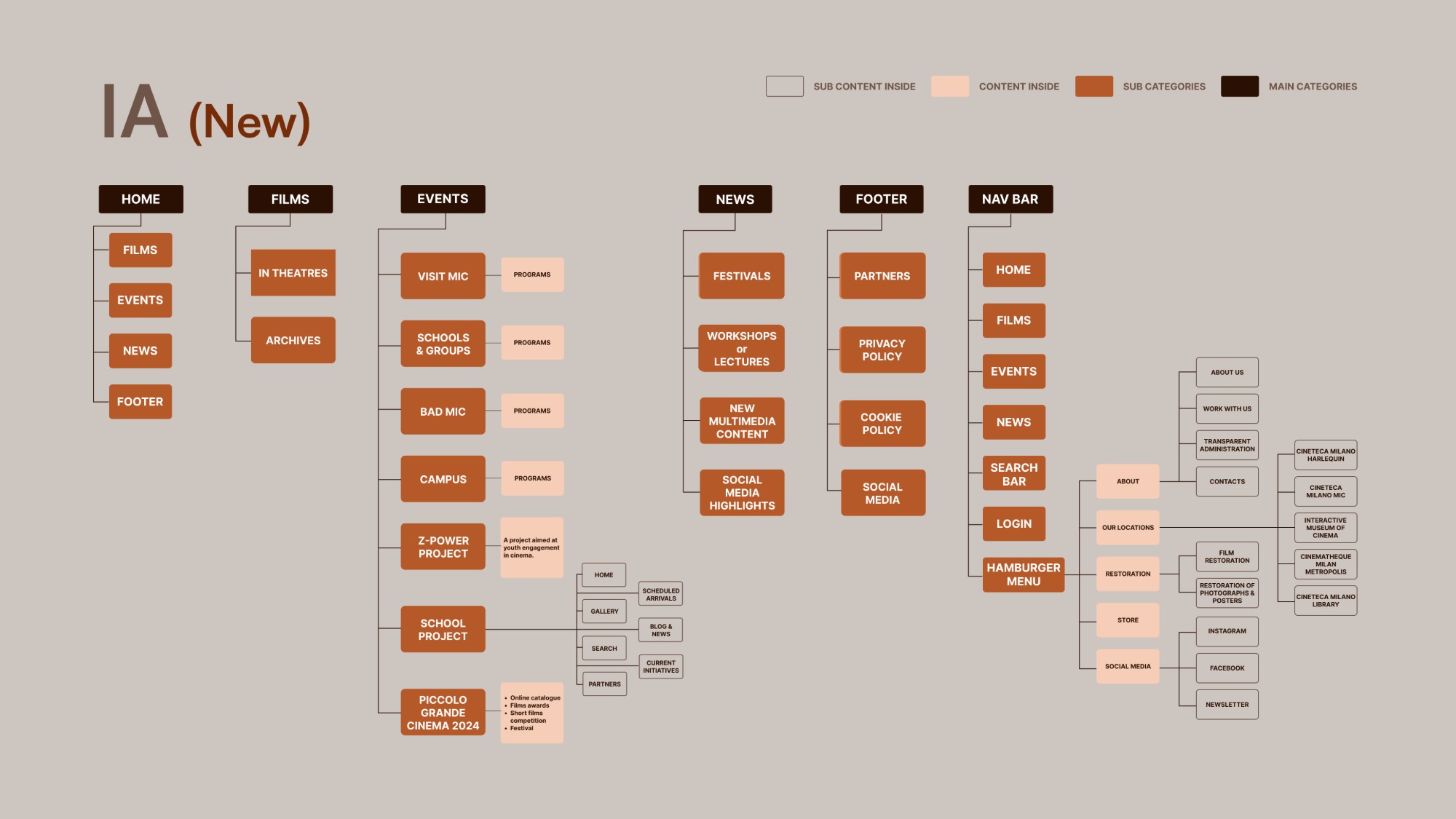
Information architecture rebuilt from the card sort
Content is grouped the way participants grouped it, not the way the old site stored it.
EvidenceCard sorting (8 participants) and heuristic evaluation: no shared logic for where anything lived.
The new information architecture, rebuilt from the card sort: main categories, sub-categories and the content inside them. Films splits into In Theatres and Archives; search and login live in the nav bar.
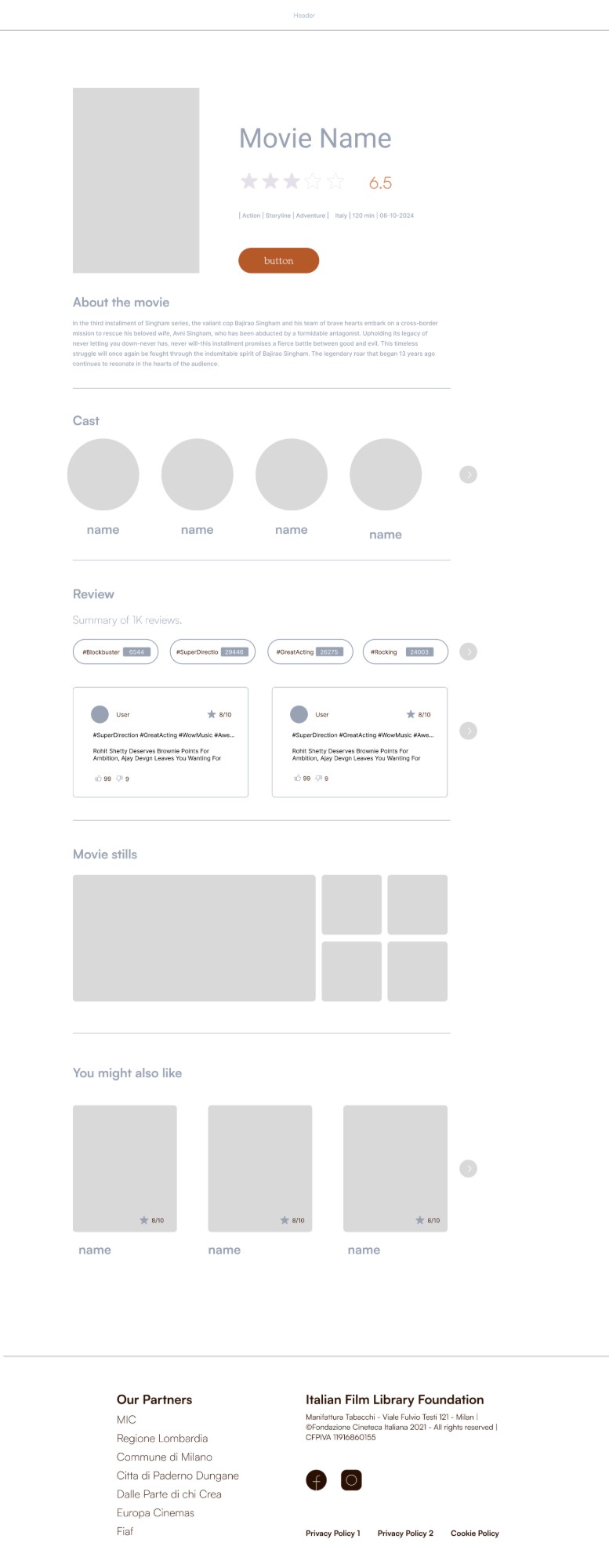
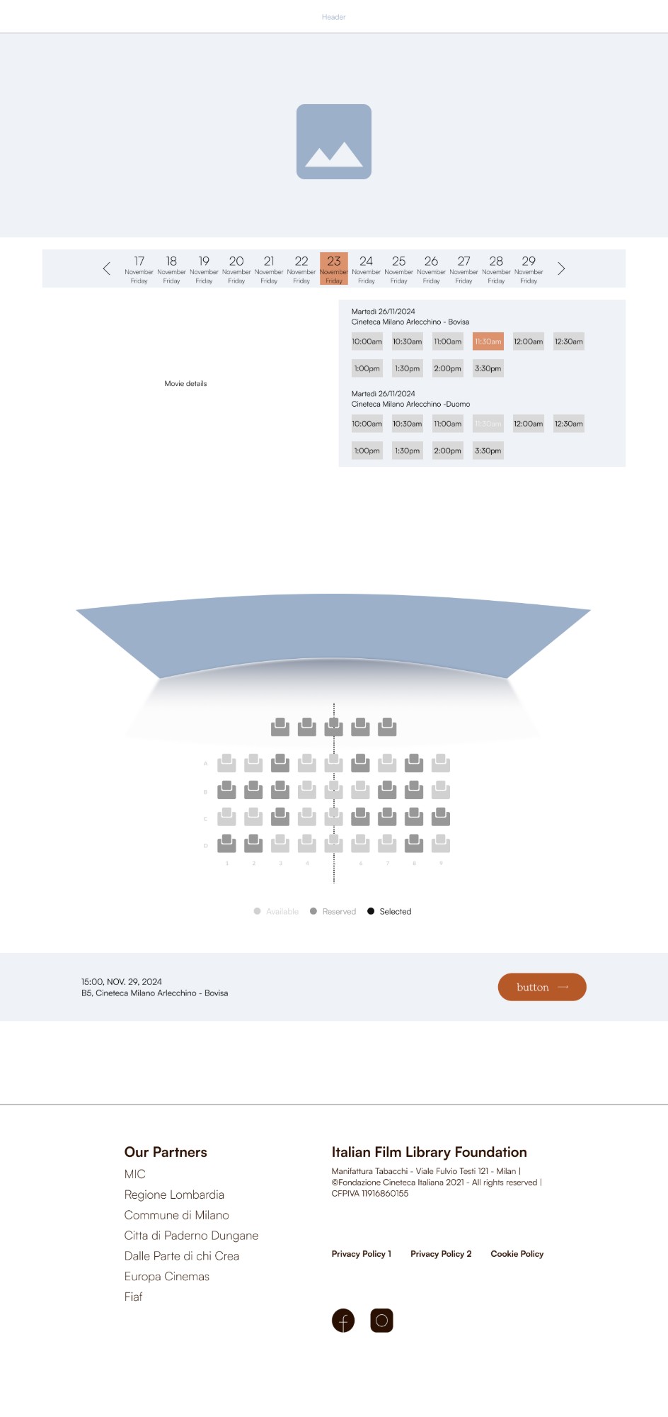
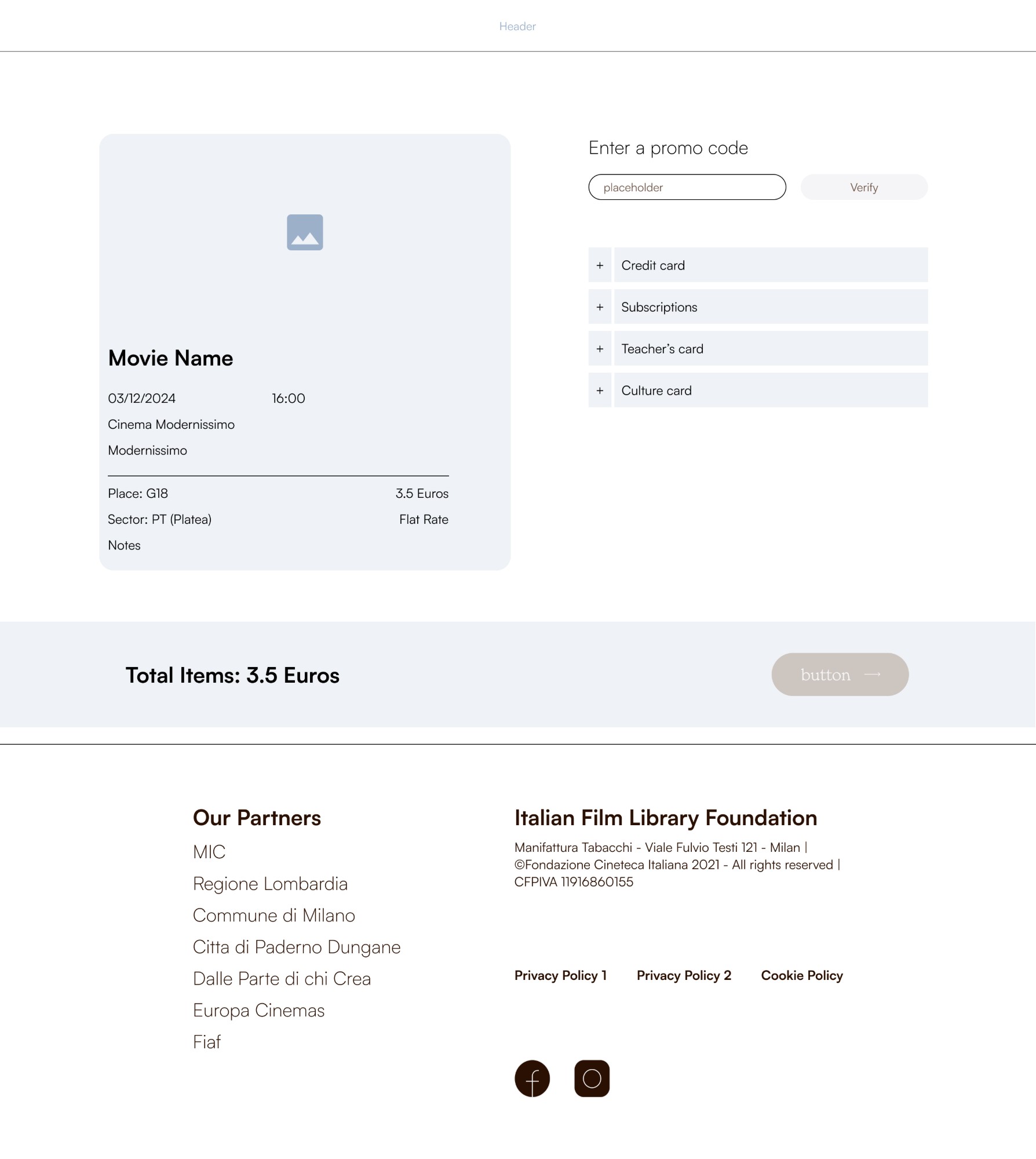
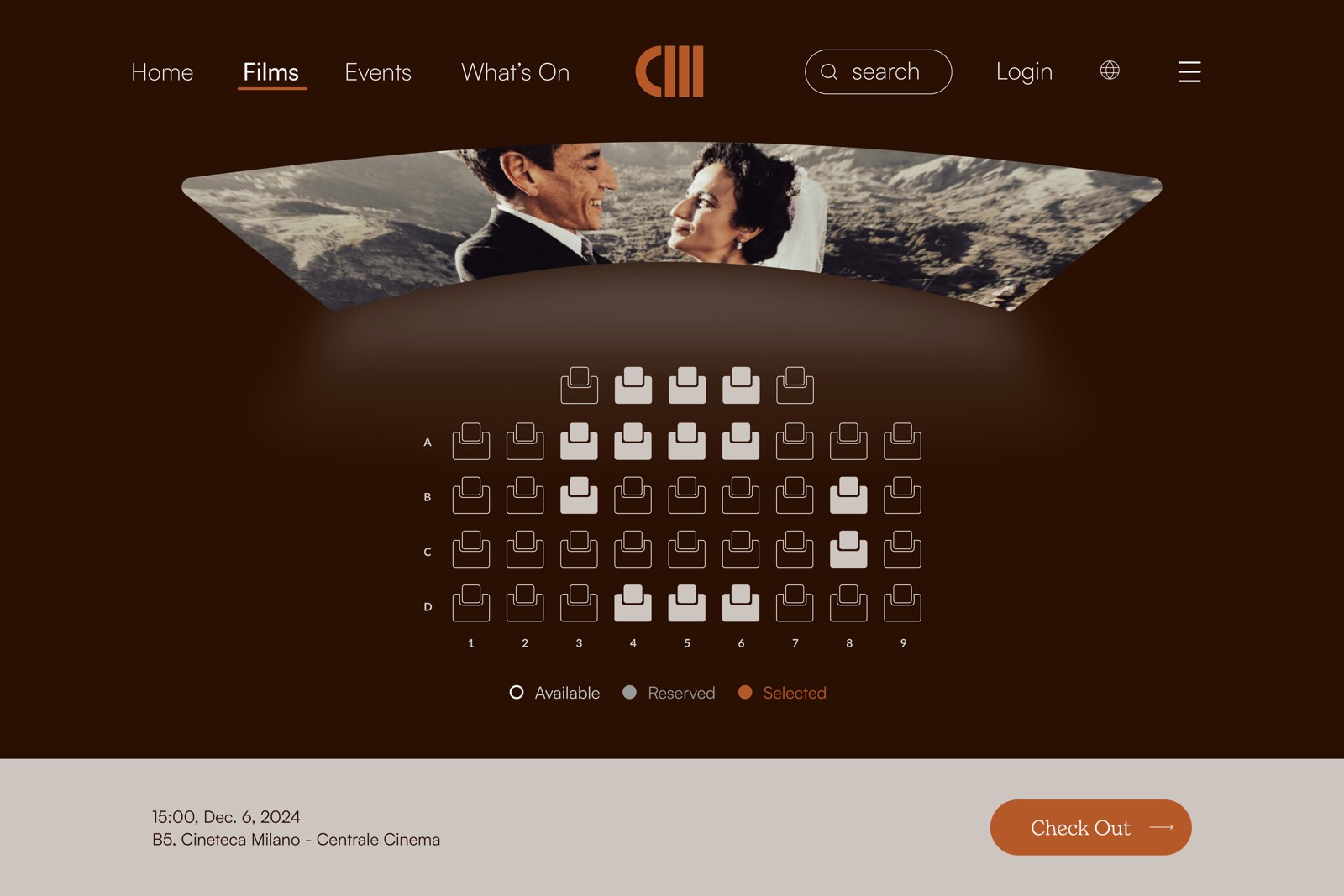
Wireframes for the flows that carry the redesign: film detail, date and seat selection, and payment.
Key decisions
Archive as logo (my concept). The logo was assigned to me individually. I was working under a tight timeline and had a print and editorial background from my bachelor's, so instead of an illustrative mark I pushed for a minimal solution that reads as archival at a glance. I moved from an initial focus on the logotype, in line with the original brand, toward a mark built from film reel and archive geometry.
Lowercase as tone (my proposal). The uppercase or lowercase question had not come up in team discussion. I raised it: lowercase makes the brand calmer and more approachable, and shifts its register from institutional announcement to cultural invitation.
Cinematic dark mode (team decision). Both dark and light directions were discussed and the team converged quickly: a film archive presenting itself against black, the colour of the cinema screen, says exactly where it lives.
EvidenceThe audit of the existing site found an identity that read as loud and fragmented rather than archival and cinematic. All three decisions answer that finding: a quieter mark, a calmer register, and the archive's own screen colour.
From the old wordmark to the new archive mark.
The palette it carries: warm, cinematic, rooted in film, from screen orange to archive brown. Select a colour to copy it.One system across desktop, mobile and tablet, not three separate designs.
Now vs. redesign
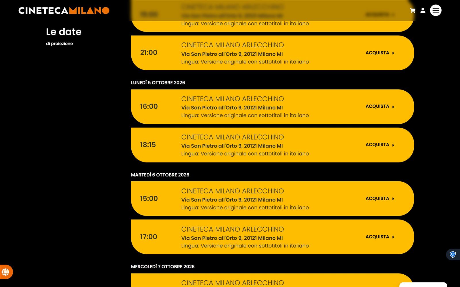
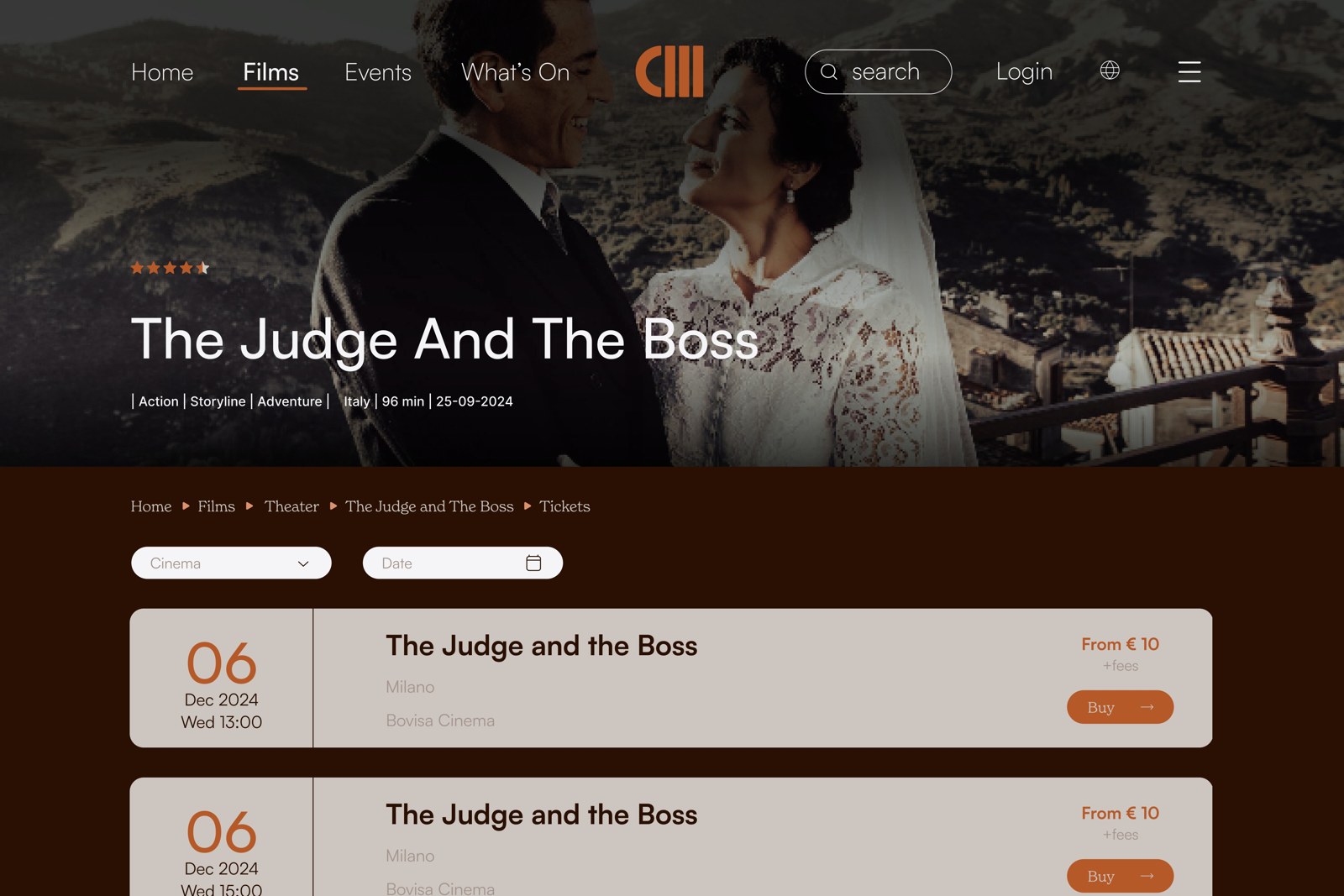
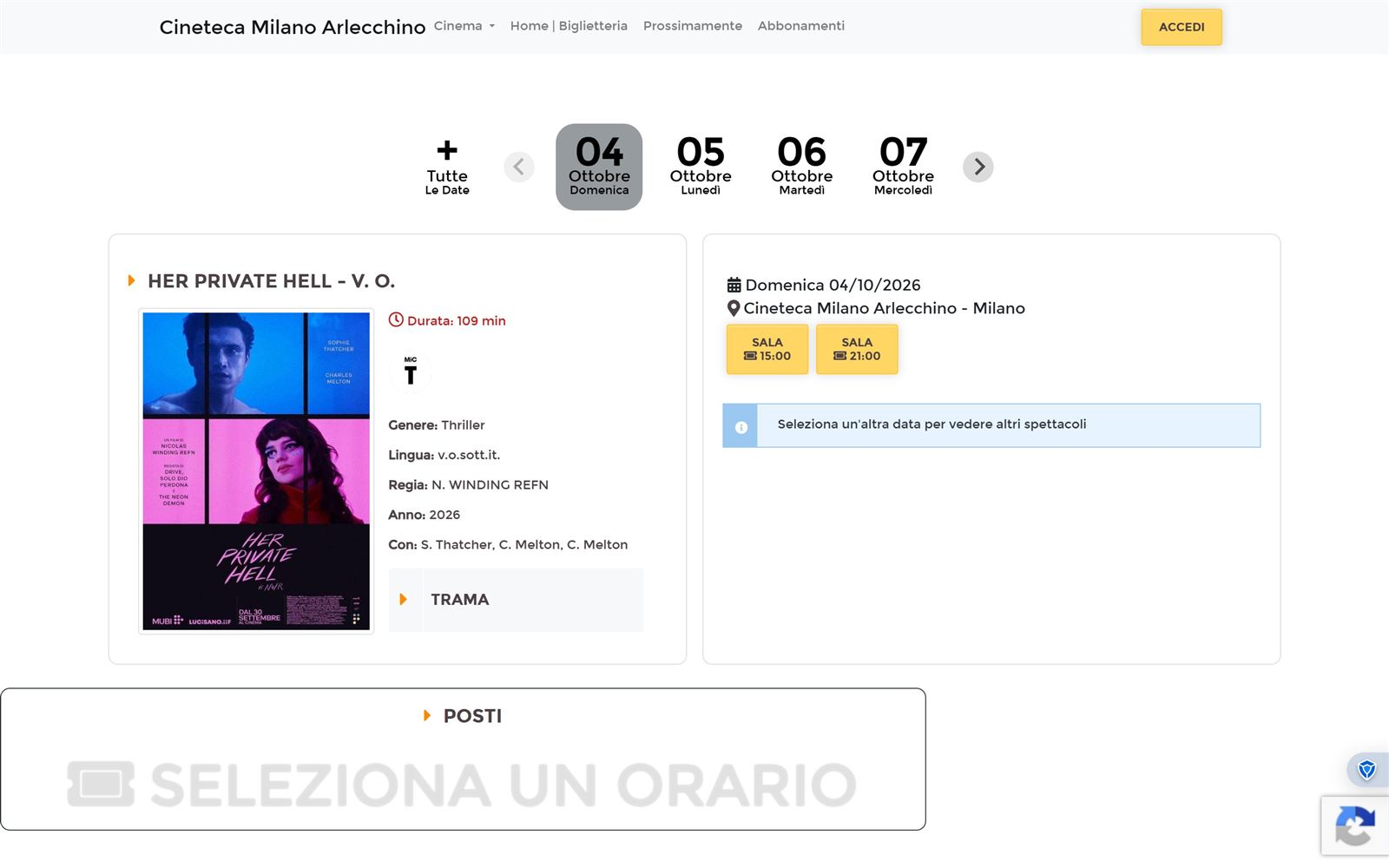
Each redesigned screen next to the page it replaces on the current site, captured in October 2026, so the problem it solves is visible rather than described.
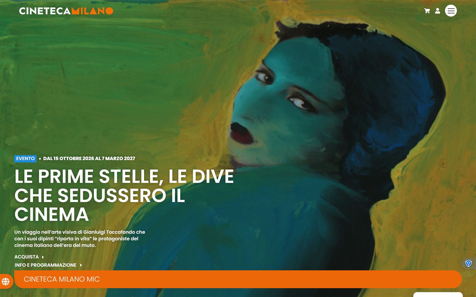
01Home
Nowcinetecamilano.itRedesignHome
Problem → changeThe header offers only a cart, an account icon and a menu; there is no search anywhere on the page, and every section sits behind the hamburger. The redesign puts Films, Events, What's On and search in the header on every page.
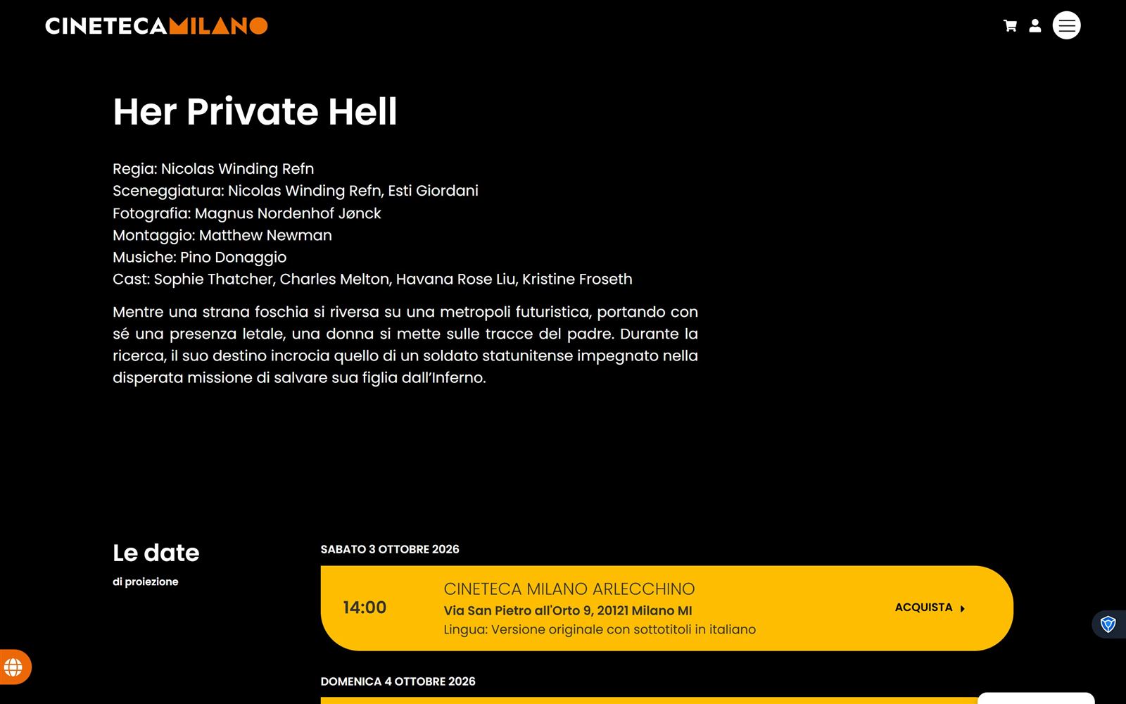
02Film page
NowFilm page, below the heroRedesignFilm page
Problem → changeCredits are a block of plain text and there is no breadcrumb, so a film is not placed anywhere in the archive. The redesign adds the path back (Home › Films › Theatre), the key facts under the title, a single Buy tickets action, and the cast as faces.
03Choosing a screening
NowScreening listRedesignTickets
Problem → changeEvery showtime is its own full-width card repeating the cinema, address and language, with no way to filter, so finding one evening means scrolling through all of them. The redesign filters by cinema and date and shows the price before you commit.
04Buying a ticket
Now18tickets, a separate siteRedesignSeat selection
Problem → change"Acquista" sends people to a different domain with its own header, yellow buttons and a second cookie banner, and the film information is shown again from scratch. In the redesign, date, seat and payment stay inside Cineteca Milano, carrying the film's imagery through every step.
05Signing in
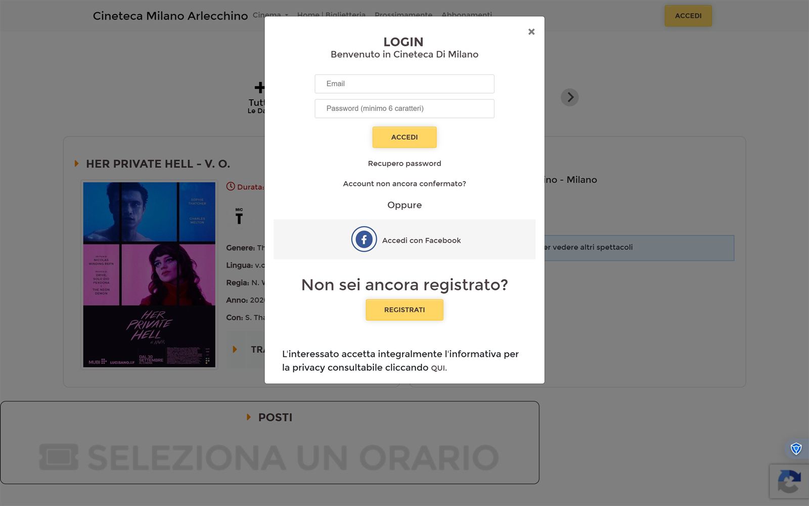
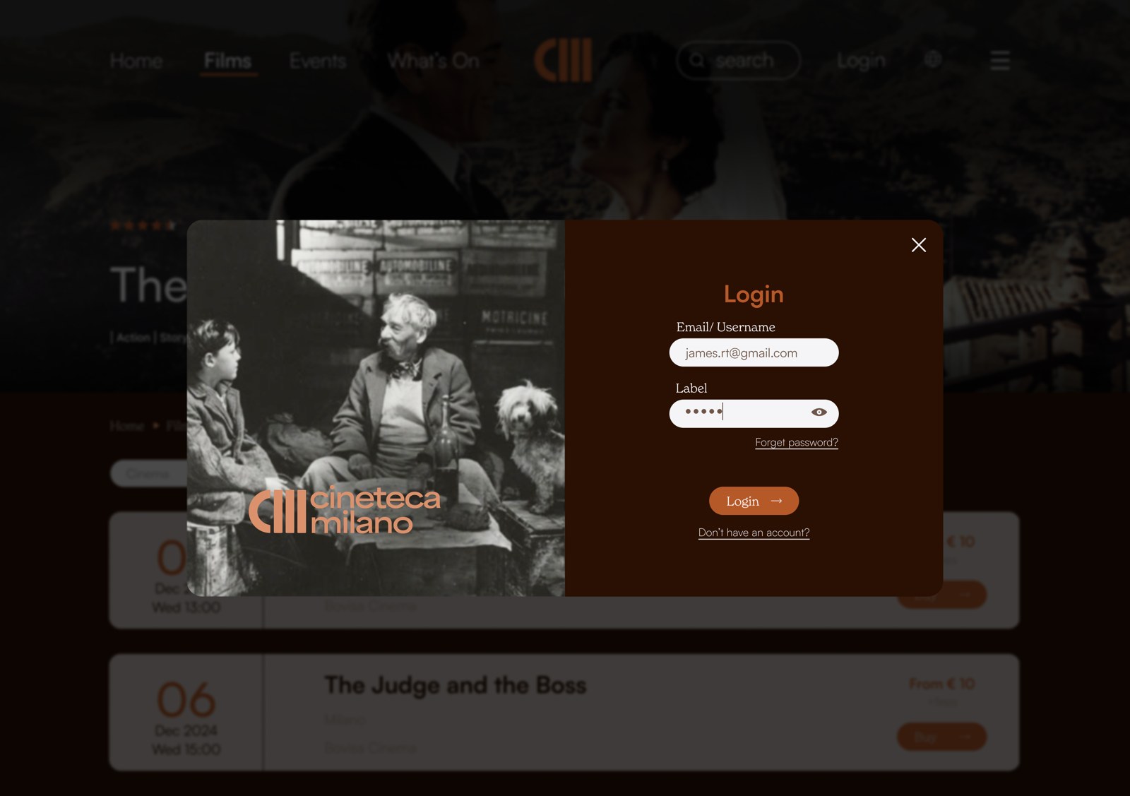
NowAfter choosing a timeRedesignLogin
Problem → changeChoosing a showtime opens a mandatory login before a single seat is visible, on a page that no longer looks like Cineteca Milano. The redesign keeps login as a short modal in the archive's own identity, over the page you were already on.
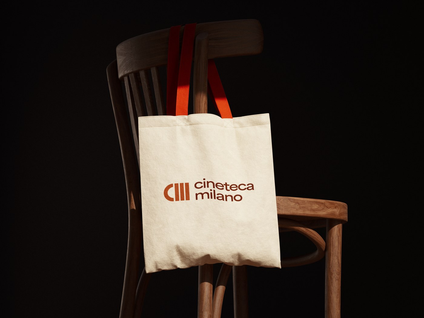
The mark was built to hold up off-screen too.
Validation and next steps
The information architecture is grounded in card sorting with 8 participants, which rebuilt how the content is grouped. The final prototype was not tested with users. That is the first thing I would do next: task-based sessions on the two flows that carry the redesign, finding a film in the archive and booking a seat.